I have seen that React is a pretty good way to build websites and decided to learn how to use it.
The tutorial that I decided to go off was developedbyed’s “Build a React Portfolio Website with Tailwind Tutorial”. The link the YouTube video is here.
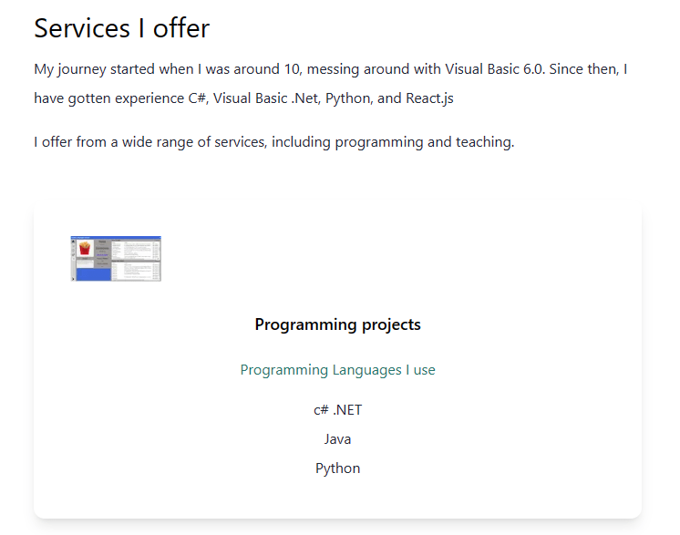
The Youtuber went over the necessary items to build a one-page portfolio that contained the end users name, title, and a portfolio of previous projects the user has done.
The things that I have learned through going through this process:
- Make sure to go through and do a basic setup of whatever language that we would be using. I thought my machine was already set for this but found out I did not have Node.js installed on the machine.
- Get an understanding on how to grab extensions from Visual Studio Code and how to setup Autocomplete for TailWindsCSS
- Learned the initial process of setting up TailWindCSS into the project. There link for the documentation is here.
- Learned how to perform basic React configuration to setup of the program to utilize TailWindCSS.
One of the major issues I had going into the project was as follows:
- TailWindCSS seemed to not be working at the beginning of the project after going through the installation process. After further testing, I grabbed the example code that was provided on the TailWindsCSS documentation page and found that how to get the styling for TailWinds is done by the className tag whereas a lot of the tags I had were classname. After changing that item, I slowly started to work through the project.
After finishing this up, it was smooth sailing until the end of the project.
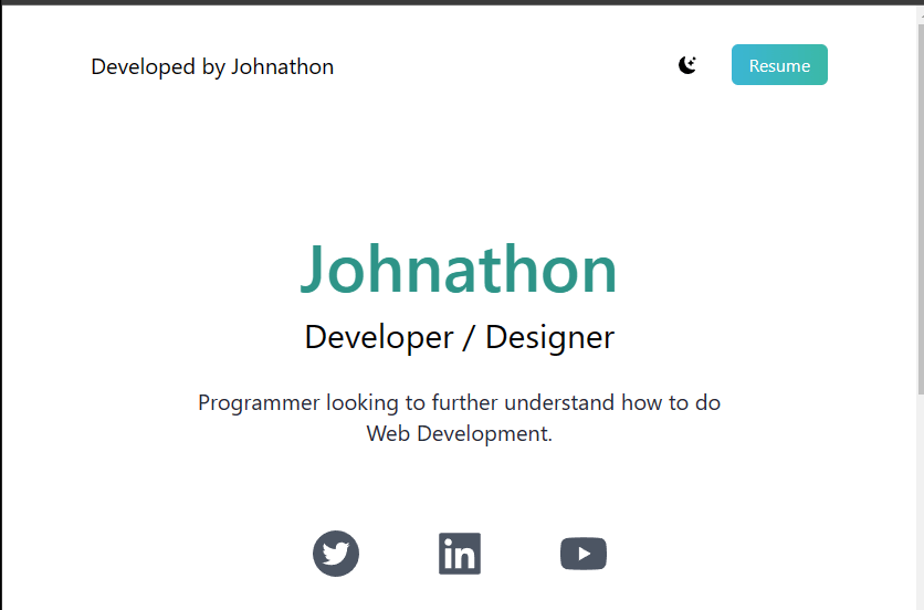
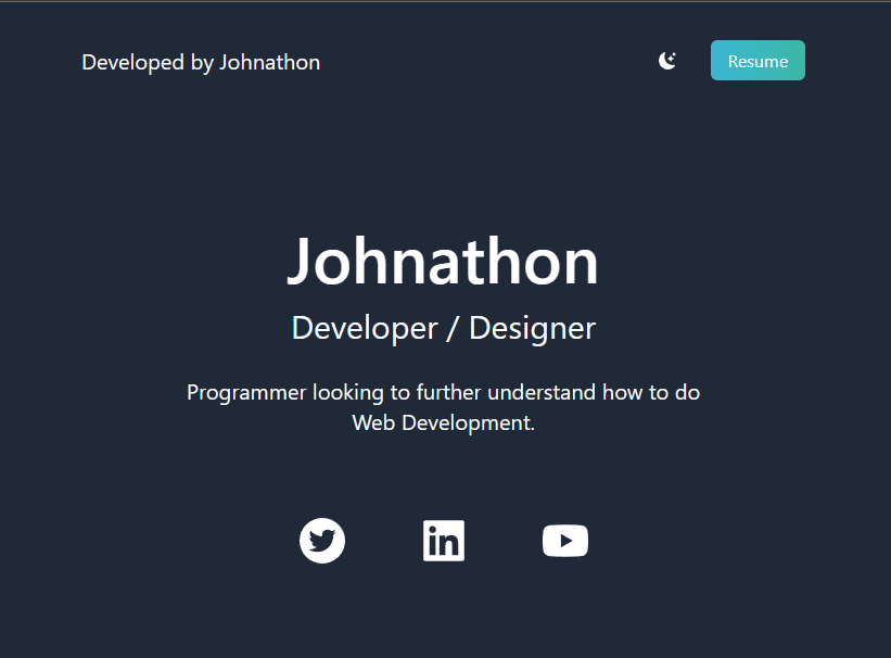
In the screenshots listed above, I learned how to utilize different react items like “react-icons/bs” and “react-icons/ai”. These both provided the graphics that were seen on the screen at the beginning with the half moon and with the different social media photos.
Another cool thing about this project was going through building the website and setting it up based on the screen size. Some sized screens that I had adjusted to were medium and large sized screens where I would change the font size based on the screen size. One example would be the main text at the beginning started at a base of px10, medium would get px-20, and large would get px-40.
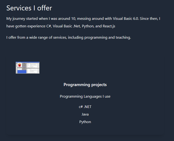
The website was also optimized to include Dark Mode. The user could click the crescent by the Resume button and it would change all of the text to white and the background to a dark gray color.
 Johnathon Kelley's Portfolio